
Personal project · 2026
Elements & Principles: A Design Card Deck
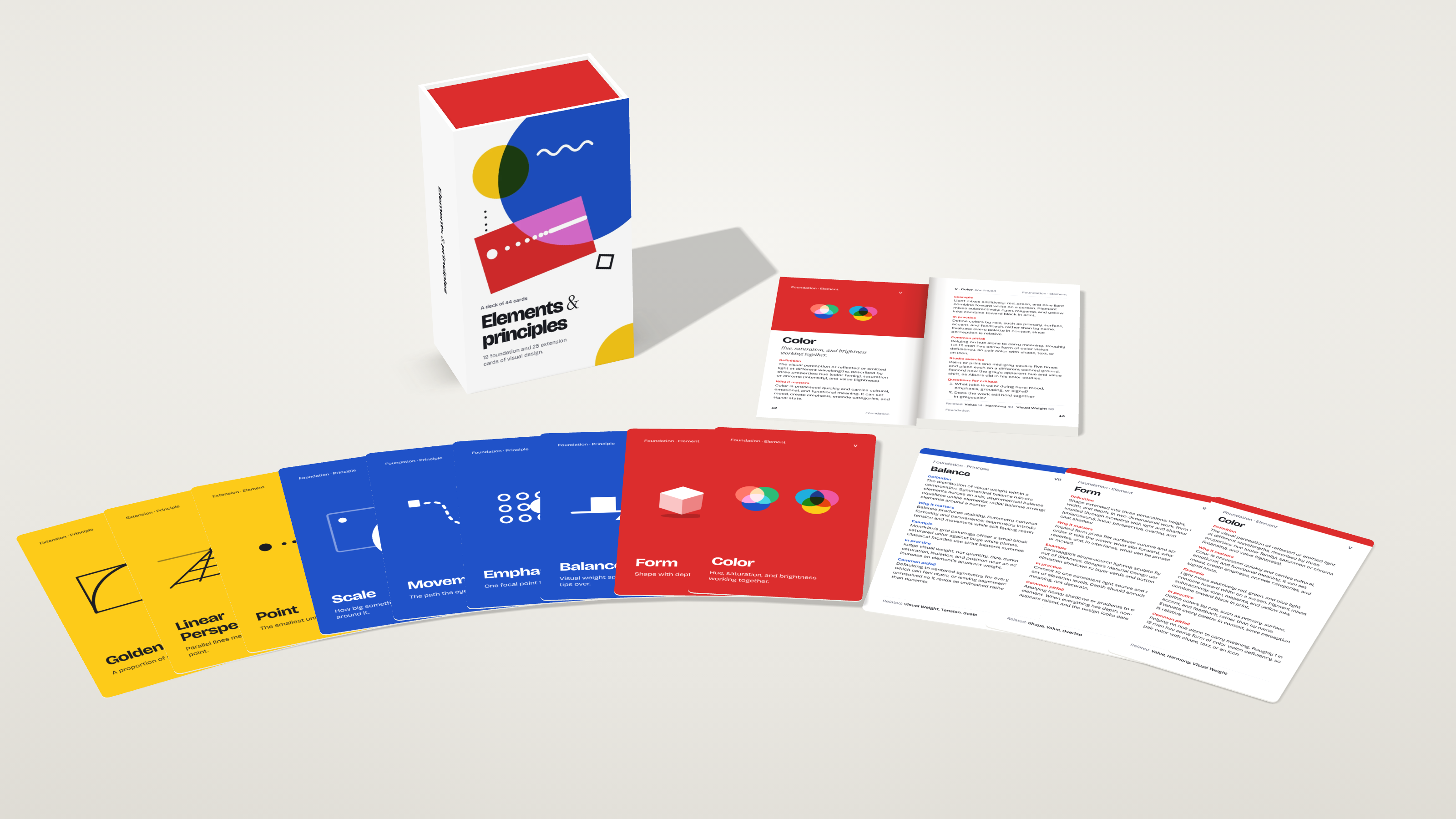
I designed a 44-card deck and a 72-page companion booklet that teach the basics of visual design, then built a 3D unboxing so you can open the box yourself.
- Role
- Designer and Developer
- Timeline
- 2026
- Company
- Personal project
- Print Design
- Packaging Design
- Editorial Design
- Typography
- Interaction Design
- three.js
Open the box
Click through it in order: open the box, take out the booklet, read it, then take out the cards and fan them out. You can also draw a three-card or five-card spread.
The problem
Most people are introduced to the elements and principles of design as a list: line, shape, contrast, balance. The list is easy to memorize but hard to use, because it tells you what the words are and not what to do with them or what goes wrong.
I wanted something you could keep on a desk and pick up in the middle of a critique.
Key decisions
One format for every card. Each of the 44 cards covers one idea in the same order: a definition, why it matters, a real example, how to apply it, and a common pitfall. The pitfall is the part I care about most. "Using lines as a substitute for spacing" is more useful to a designer than a restatement of what a line is. Each card also lists related cards by name so that one idea leads to the next.
Foundation first, then extension. The deck has 19 foundation cards, split into elements (line, shape, value) and principles (contrast, emphasis, scale). Another 25 extension cards go deeper with ideas like overlap, tension, and atmospheric perspective. Red, blue, and yellow mark the three groups so that you can sort a pile by color.
A booklet that gives you something to do. The booklet covers the same cards at greater length, and adds a studio exercise and questions for critique to each one. Simply put, the cards teach the idea and the booklet makes you practice it. A page of "fill a sheet with twenty lines that each express a different mood" teaches more than a paragraph about line.
Spreads for critique. The deck is meant to be dealt, not just read. Draw three or five cards, then ask what the work shows on each one. The 3D piece lets you try this yourself.
The system
The whole set uses two typefaces. Bricolage Grotesque carries the headings and text, while Instrument Serif adds the italic one-line definitions and the ampersand in the title. The palette is the same red, blue, and yellow as the card groups, over white. Each foundation and extension card shows a small geometric mark made from circles, squares, and lines, so the cards use the same vocabulary they teach.
Building the unboxing
A box is better opened than described, so I built the unboxing as a real-time 3D scene in three.js. Every card face, booklet page, and piece of box artwork is a texture on a model (169 images in all), so what you read in the scene is the printed material itself.
It runs as a self-contained page with no outside requests, and it follows your light or dark setting. It also works on a phone, with the controls laid out beneath the 3D view.